JR Personal Training
Cliënt:
JR Personal Training
Website:
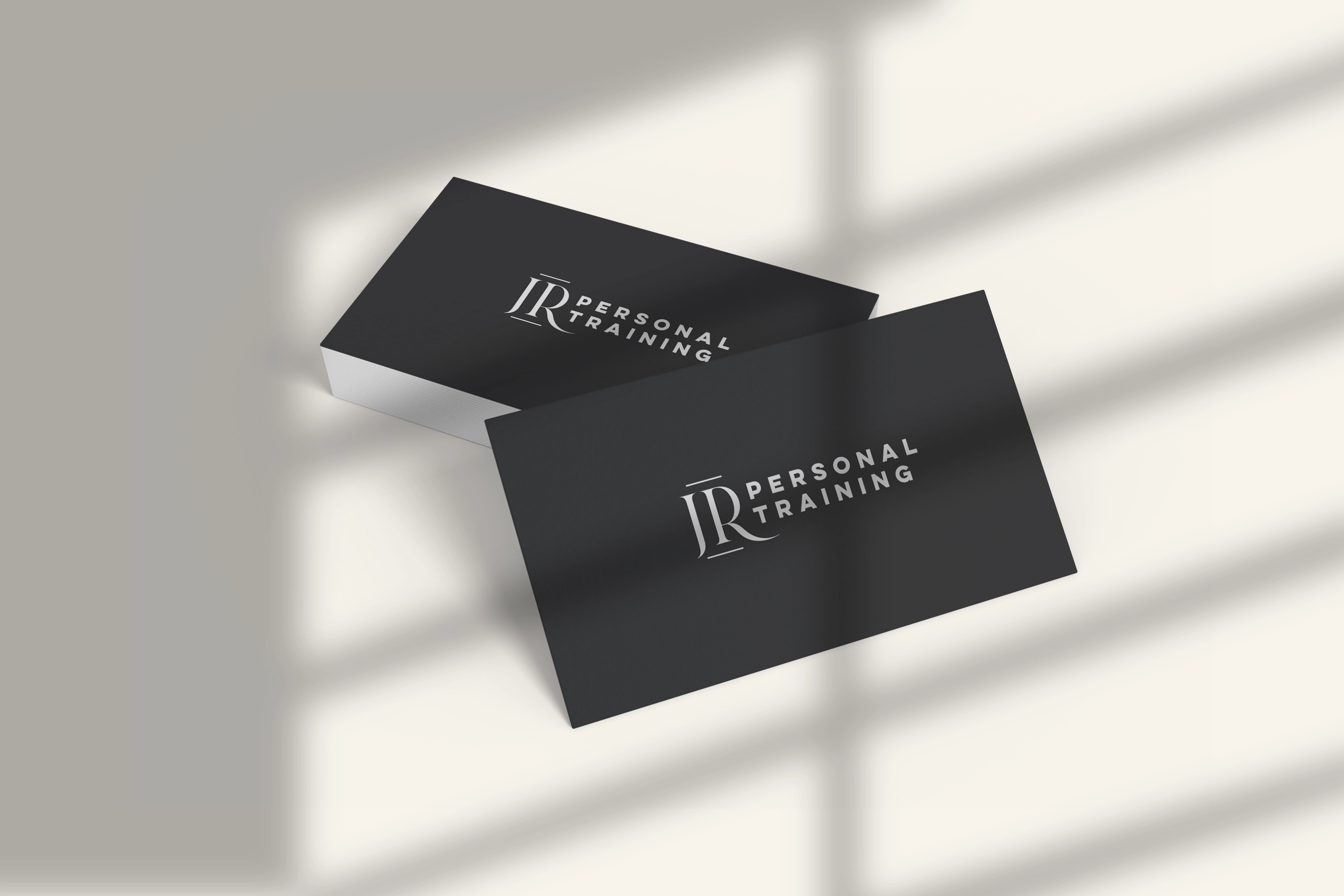
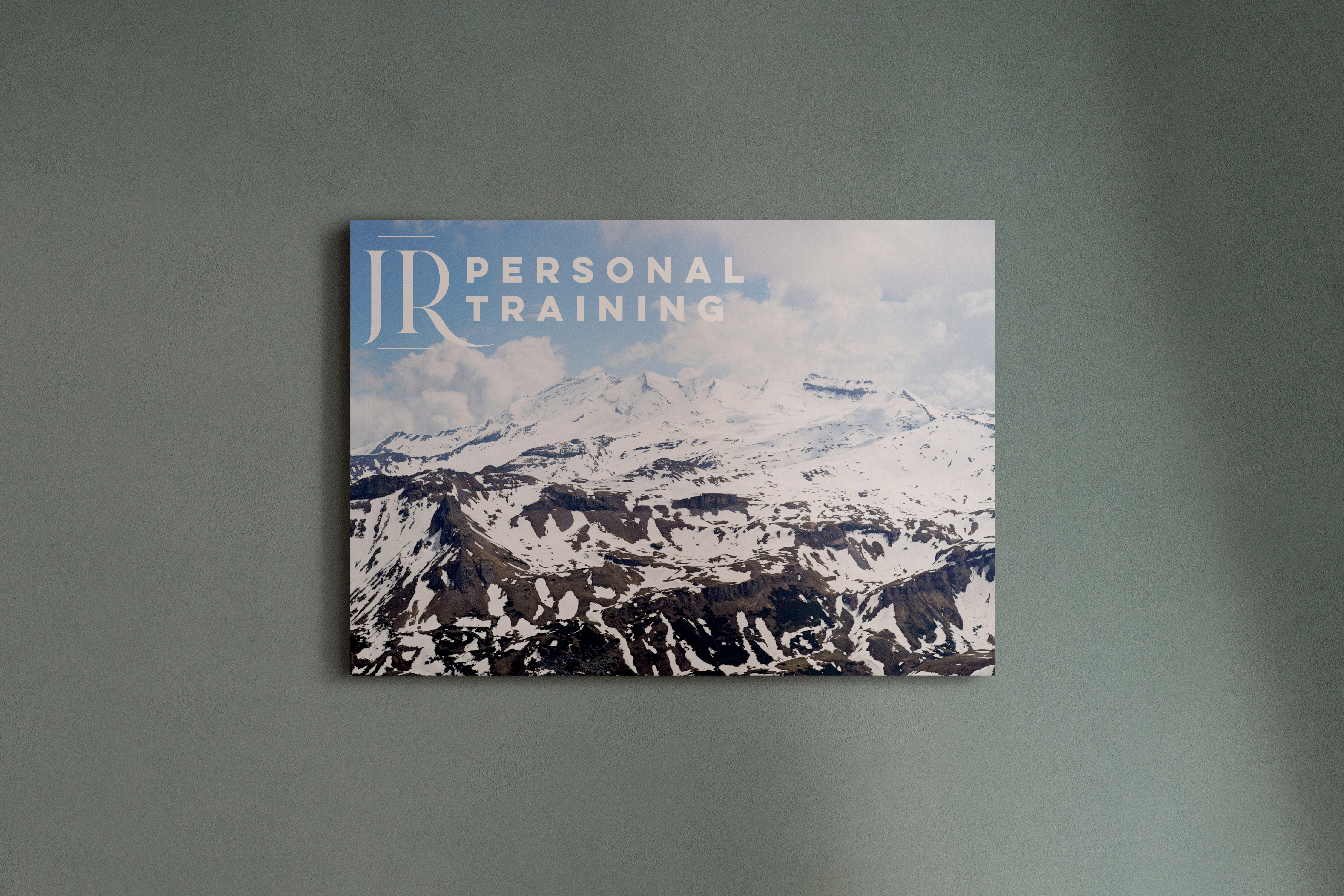
The logo we conceptualized reflected the dynamic nature of fitness progress. A stylized figure in motion, created with bold, fluid lines, captured the essence of movement and transformation. The use of vibrant, motivational colors underscored JR Personal Training's commitment to energizing clients on their fitness journey.
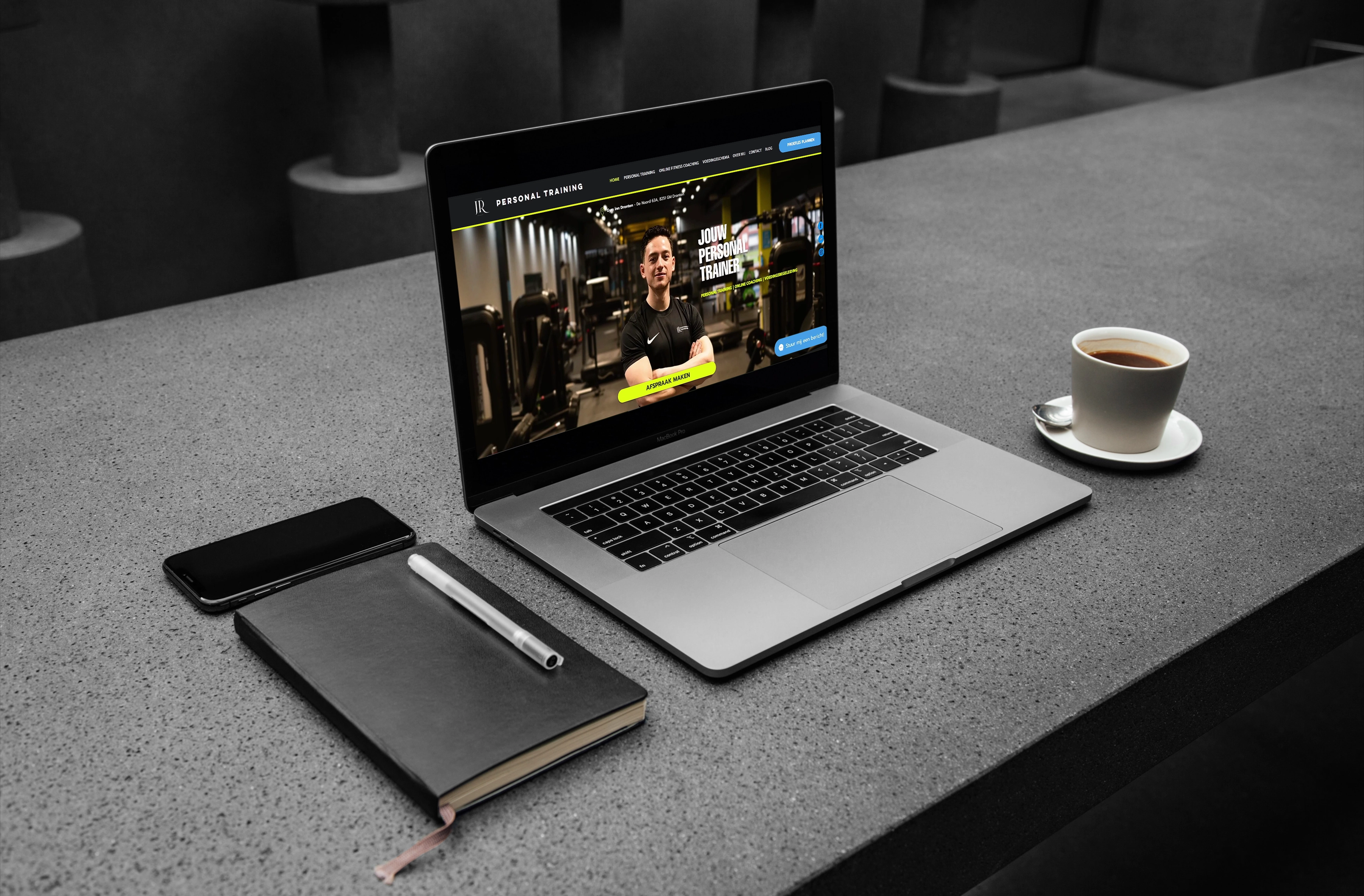
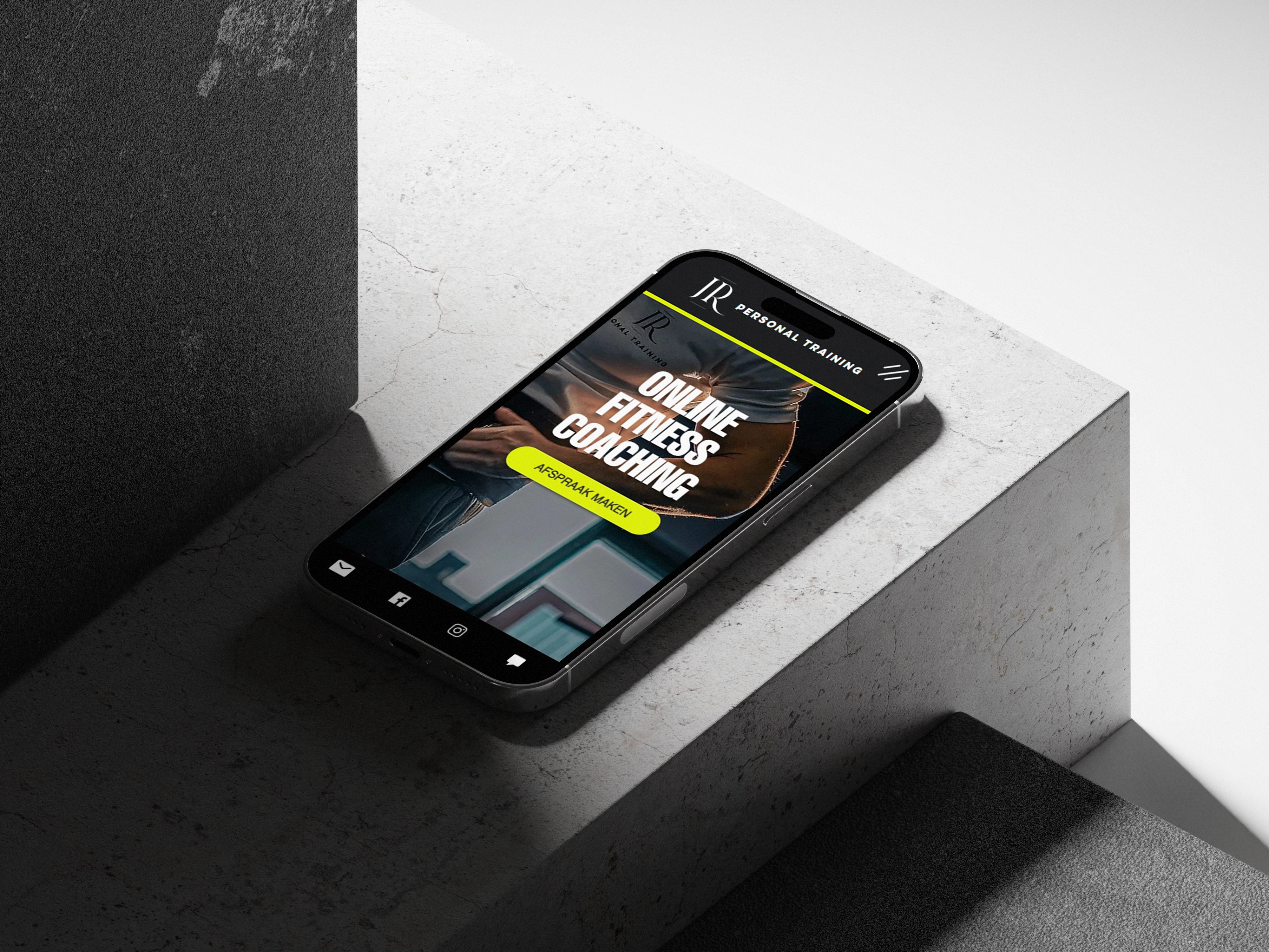
The website we crafted embodied the principles of user-centric design. A clean and intuitive interface guided visitors through JR Personal Training's services, showcasing client success stories and highlighting the advantages of online coaching. The integration of before-and-after visuals and testimonials provided a compelling narrative of results achievable through their programs.
The color palette blended invigorating bold blue and neon yellow/green, symbolizing vitality and growth. A modern and legible sans-serif font ensured seamless readability across devices, amplifying the user experience.
Kleuren: